Toblerone's logo, from then to now
Toblerone's logo is an iconic image that is recognisable worldwide. With its unique shape and distinctive font, the logo has evolved over the years. Let's go back in time and explore the history of the Toblerone logo, from its early years to the present.
The birth of Toblerone
Before we talk about the logo, a brief introduction about the Toblero brand is in order, of course. Toblerone is a Swiss chocolate brand and was founded in 1908 by Theodor Tobler and his cousin Emil Baumann. The brand wanted to create a distinctive identity and chose a triangular shape for the chocolate bar, inspired by the nearby Swiss Alps. The first Toblerone logo was simple and consisted of the brand name written in an elegant, ornate font. It was a timeless design that laid the foundation for the brand's visual identity.
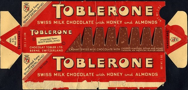
Toblerone logo 1930
In the 1930s, the Toblerone logo was revamped. For the first time, the brand name was surrounded by a stylised frame. The brand also wanted to put more emphasis on the fact that it was a product from Switzerland. They did this by adding a bird + gondola as an image mark and the triangular shape of the packaging was given more emphasis. This design reinforced the brand's association with the Swiss Alps and created a sense of quality and authenticity.
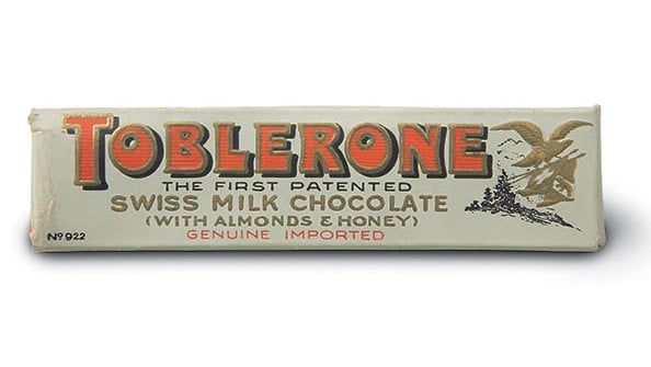
Toblerone logo 1970
In the late 1960s and early 1970s, the logo evolved further. The typeface took on a more modern look and the triangular shape was given even more prominence with the arrival of the Matterhorn mountain as a visual mark. The Matterhorn is a Swiss national symbol and was a perfect fit for the logo and the company. Overall, the logo became tighter and more minimalist, fitting the graphic style of the time. The logo's creators also 'hid' a bear in the mountain. This emphasised the arrival from Bern, which was called the capital of bears.
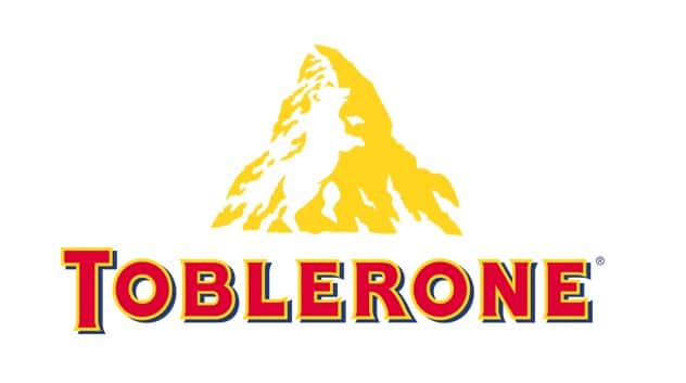
Toblerone logo 2023
The current Toblerone logo had to be changed at the request of the government. Because the company had moved much of its production to Slovakia, it was no longer national enough and they were no longer allowed to use the Matterhorn as their logo. The logo otherwise remains true to the original design elements, but with a contemporary twist. The brand name is still written in the recognisable font, but now it is placed in a rectangular frame with rounded corners. This gives the logo a more streamlined and modern look.

The iconic Toblerone font
Over the years, the Toblerone logo has undergone several modifications, but the distinctive font has always been retained. The clean, eye-catching font has contributed to the brand's recognisability and has become an essential part of Toblerone's visual identity.


